Here is a small example with explanations for the calculations:
The matrix to normalize:
v1 v2 v3
s1 2 5 6
s2 6 7 2
s3 4 9 1
vm1 = (2 + 4 + 6) / 3 = 4
vs1 = sqrt(((2 - vm1)^2 + (4 - vm1) ^2 + (6 - vm1) ^2) / (N - 1)) = sqrt((4 + 4) / (2)) = sqrt(4) = 2
vm2 = (5 + 7 + 9) / 3 = 7
vs2 = sqrt(((5 - vm2)^2 + (7 - vm2) ^2 + (9 - vm2) ^2) / (N - 1)) = sqrt((4 + 4) / (2)) = sqrt(4) = 2
vm3 = (6 + 2 + 1) / 3 = 3
vs3 = sqrt(((6 - vm3)^2 + (2 - vm3) ^2 + (1 - vm3) ^2) / (N - 1)) = sqrt((9 + 1 + 4) / (2)) = sqrt(7) ~=2.6458
where vmX is the mean for the variable X, vsX is the standard deviation of variable X and N = the number of samples.
We then apply:
vnXY = (vXY - vmX) / vsX
where vnXY is the normalized value and vXY is the original value for the variable number X and sample number Y. For example, variable 1 in sample 1 is transformed like this:
vn11 = (v11 - vm1) / vs1 = (2 - 4) / 2 = -1
This gives the new matrix:
vn1 vn2 vn3
s1 -1 -1 1.1339
s2 1 0 -0.3780
s3 0 1 -0.756
Each variable value is the delta from mean expressed in unit variance (meaning 1 equals the standard deviation).
The original matrix above was imported into Omics Explorer and plotted as a heat map just to show how the scale fits with the data:
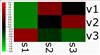
Notice that s2v2 and s3v1 are black since their normalized values are 0 and that the positive values are shades of red and the negative values shades of green.
If you look at the color legend, you will see that it goes from -2.0 to 2.0 which means the scale goes from two standard deviations less than the mean to two standard deviations greater than the mean.
The actual color legend scale is calculated based on a quite complex algorithm. If you are not happy with the scale, you can set it manually from the "More plot Settings" dock window.
|  |